Title: Michael Clayton (2007)
Director: Tony Gilroy
Director of Photography: Robert Elswit
Michael Clayton is a movie about a man who works for a law firm "fixing" cases. One case, in particular, has Michael stepping in after a high-powered attorney has a nervous breakdown, nearly ruining a multi-billion dollar case.
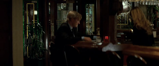
The lighting of the shot is the most dominant aspect of this scene. Each scene is shot with very dull and dark colors, brown and black being the two vital colors. In this first scene, Michael enters the restaurant, but the camera is set up away from the door, with a man in between it and Michael. This was obviously to convey the distance Michael has created between him and other people, and, combined with the dark colors, tells you that this is all a mystery and eerie, in a sense. You still don't know who is trying to kill Michael, so the dark lighting helps tell you that.
The depth of field is also interesting. Not until he passes the man at the bar does Michael come in focus, which is an interesting, but necessary, choice in composing this shot.
Also, as Michael walks towards the camera, you see his face moving in and out of the light, almost symbolizing how he operates...staying behind the scenes and "fixing" things.
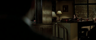 Next, you see Karen (played by Tilda Swinton) away from the camera, yet she's the one in focus. Michael, in the foreground, is completely out of focus, continuing with the mystery that makes up Michael.
 The lights surrounding Karen are all dimly lit, also adding to the continuity of these particular scenes. Anything shot in bright light would distract the viewer and take away from the graveness of the subject matter.
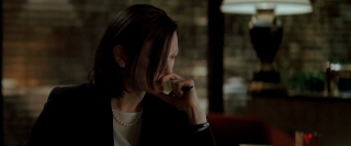 I really like the beginning of this shot, how Karen's hair covers part of her face, as if the D.P. is attempting another way to show the viewer that these are mysterious characters, but without recycling the same "out of focus, moving in and out of the shadows" technique.
 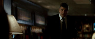 Finally they show Michael approaching Karen without the shadows covering his face. This is a very dominant theme throughout the scene, not to mention the entire movie, and this is certainly a shot that breaks from this consistent theme. Everything in the background is out of focus, unlike the previous scene where everything was in focus other than Michael.
This shot-reverse shot is necessary to help show where they are in relation to each other, and once again Michael is still in focus, while everything else remains blurred. This helps show the viewer that you need to be concentrating on Michael's character and everything he has to say. In this shot, he is getting ready to say something, so this helps show the viewer that you need to be ready for when he begins to talk.
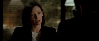
Just like the shots of Michael, every shot of Karen talking shows everything in the background out of focus. This was obviously a decision the D.P. made to tell the viewer that they need to pay attention to what these characters have to say, as this is an integral part of the movie and is a miniature climax.
Just like the other scenes, everything is dark, from her hair to her coat, to the shoulder and hair of Michael.


